Bringing the fruit of quality to life.
For over 25 years, Mexican brand CATO, a leader in ceramic furniture manufacturing—has been standing out for quality at accessible prices.
But as Asian competitors began to enter the market, the meaning of “quality” became blurred for many Mexican consumers.
CATO needed to reinvent itself, transforming its brand identity to match the true excellence of their products.
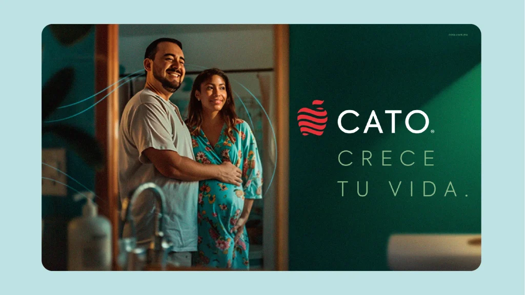
Through CLAY®’s Brand Synchrony System, we defined a new territory for them: the pursuit of growth.
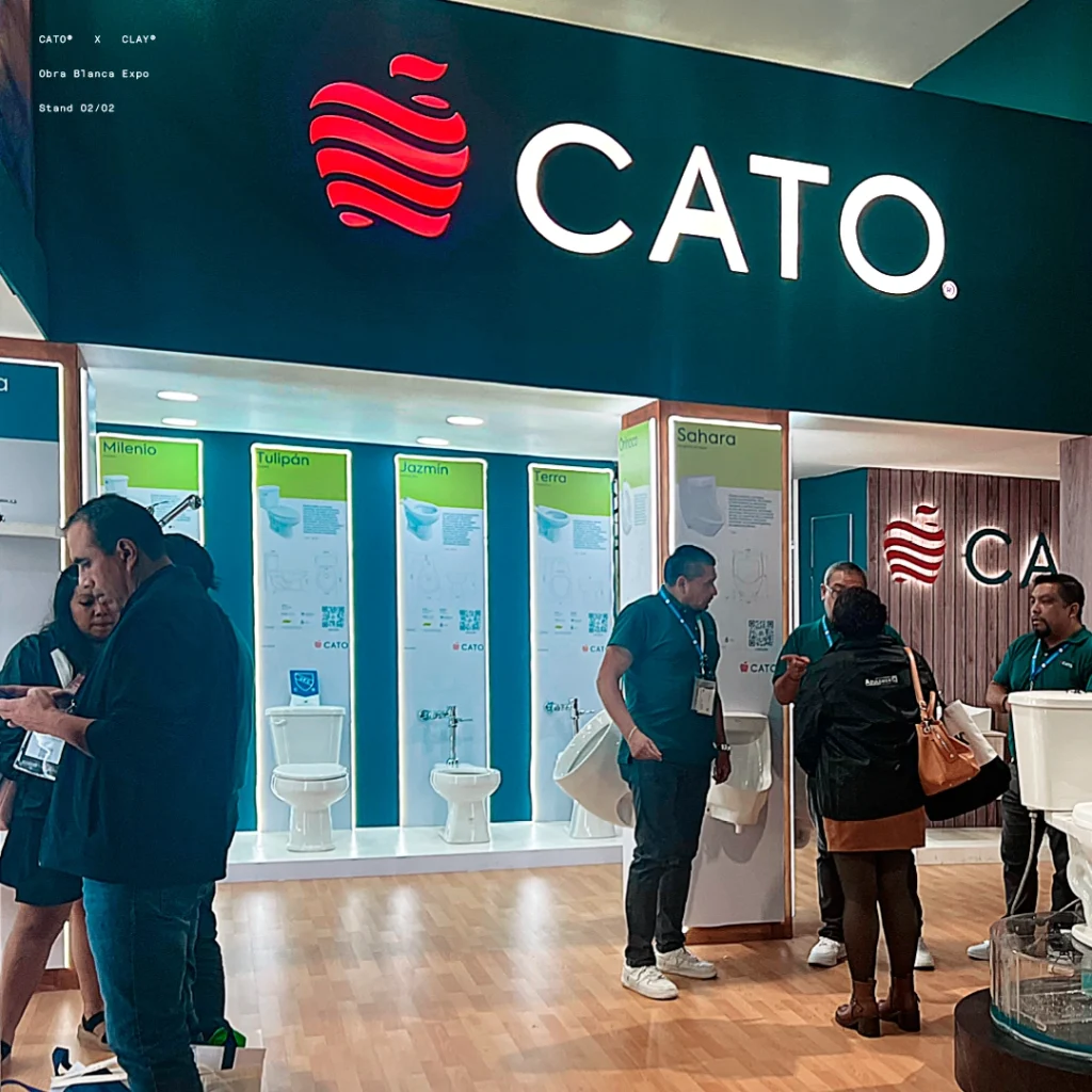
This pursuit is symbolized by the CATO Apple, representing the fruit of effort.
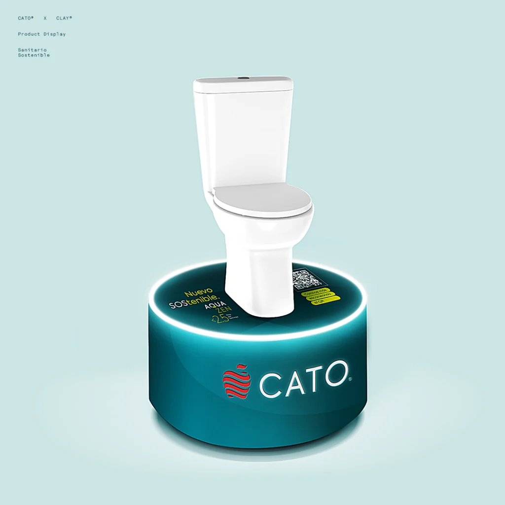
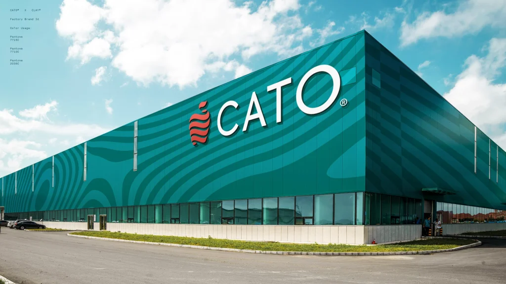
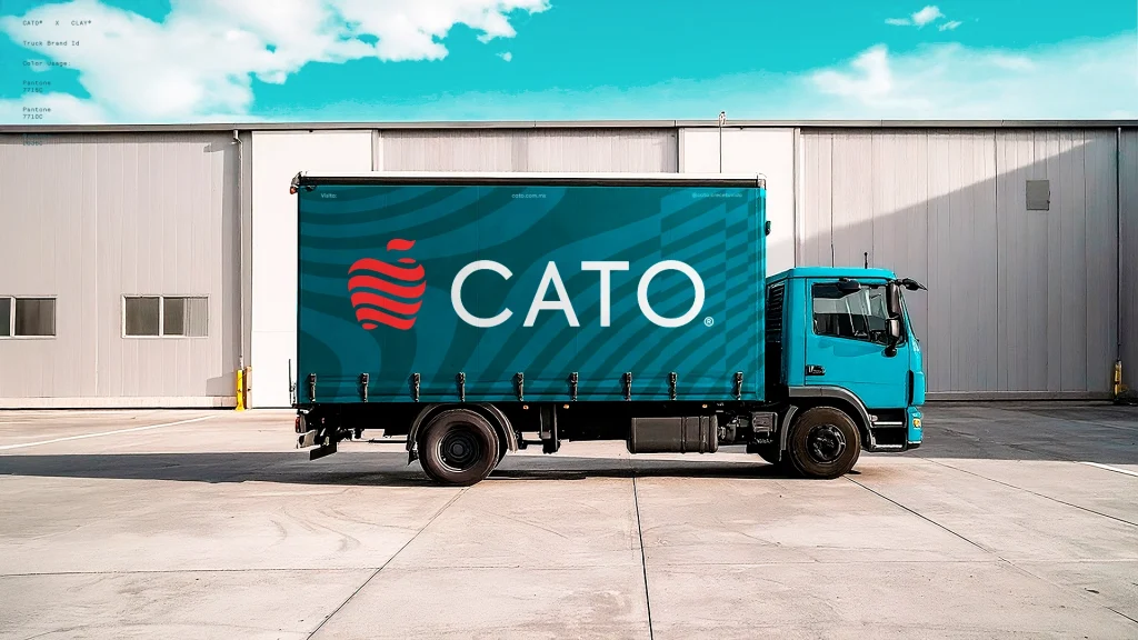
We also created the CATO Color—a unique blend of blue (innovation) and green (sustainability)—a visual metaphor for conscious growth.
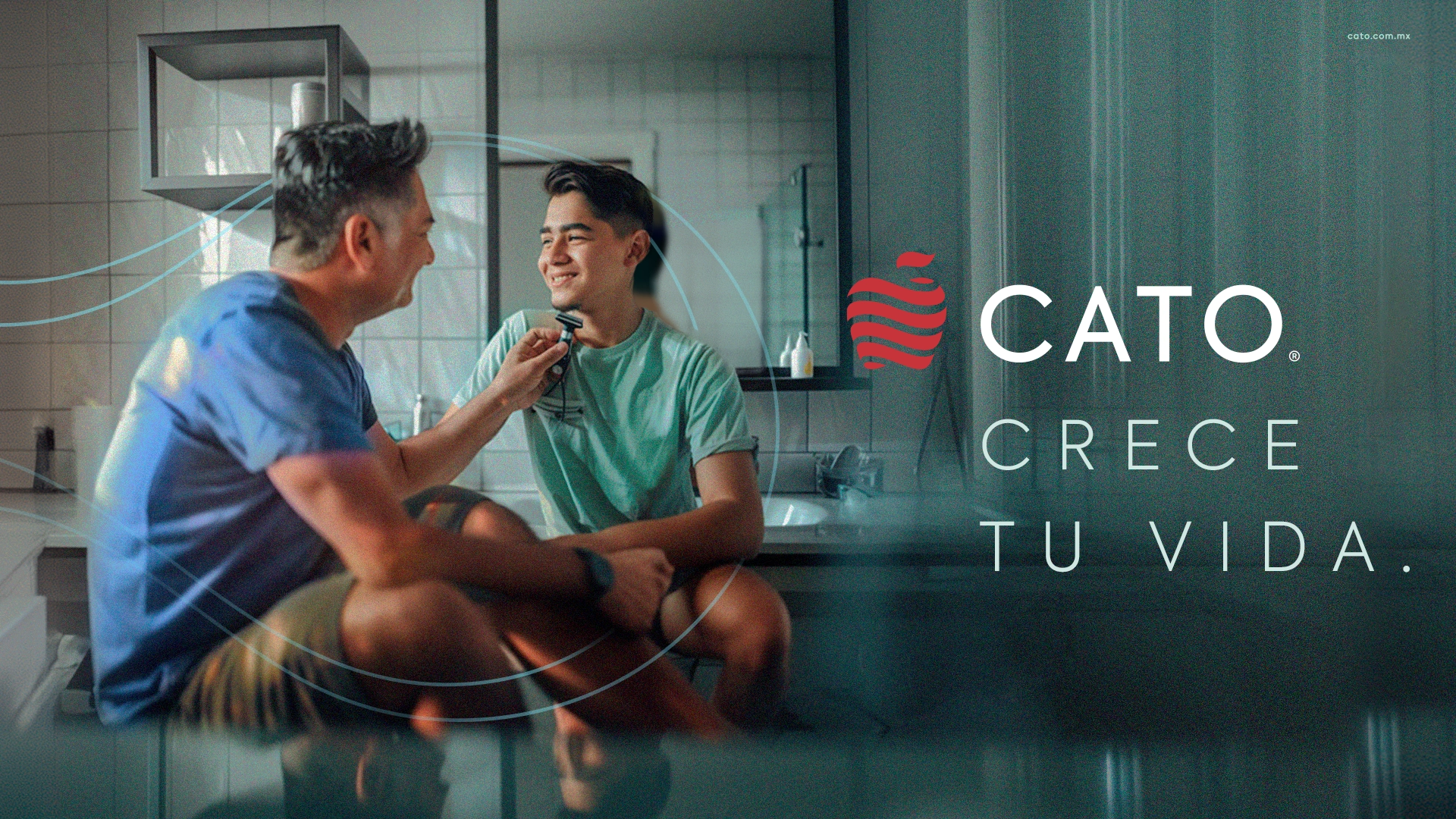
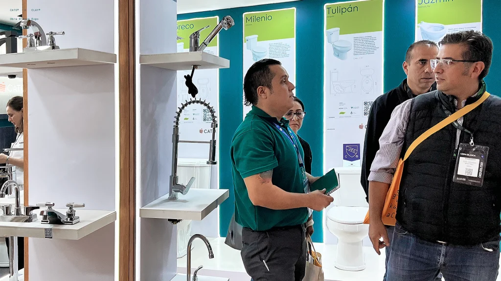
Under the concept “CRECE TU VIDA” (grow your life), we launched the new brand identity at EXPO OBRA BLANCA, the most important commercial show in the industry.
Since then, we’ve driven this transformation through key point-of-sale activations and engaging social media content, highlighting products, innovations, and initiatives like water conservation.
CATO’s commitment hasn’t changed, but now its identity and brand communication are fully aligned with the quality of their products.

Related projects
Building a home for community culture.